
Master Color Temperature Guide – Essential Tips & Facts
- 2024-03-15 19:13
- UNITOP
Walk into a hospital and notice how the lighting feels crisp and energizing. Step into a high-end restaurant and you're surrounded by warm, intimate light. Same LED technology, completely different experiences. The difference? Color temperature.
Most people choose the wrong color temperature for their spaces because they don't understand what those Kelvin numbers actually mean. You'll see 2700K, 4000K, 5000K on product specs, but which one fits your project? Pick too warm and your workspace feels sluggish. Go too cool in a bedroom and you'll stare at the ceiling at midnight.
This guide breaks down color temperature so you can select the right Kelvin rating for any application. You'll understand the science, decode the numbers, and match temperatures to specific rooms and uses.
What Is Color Temperature?
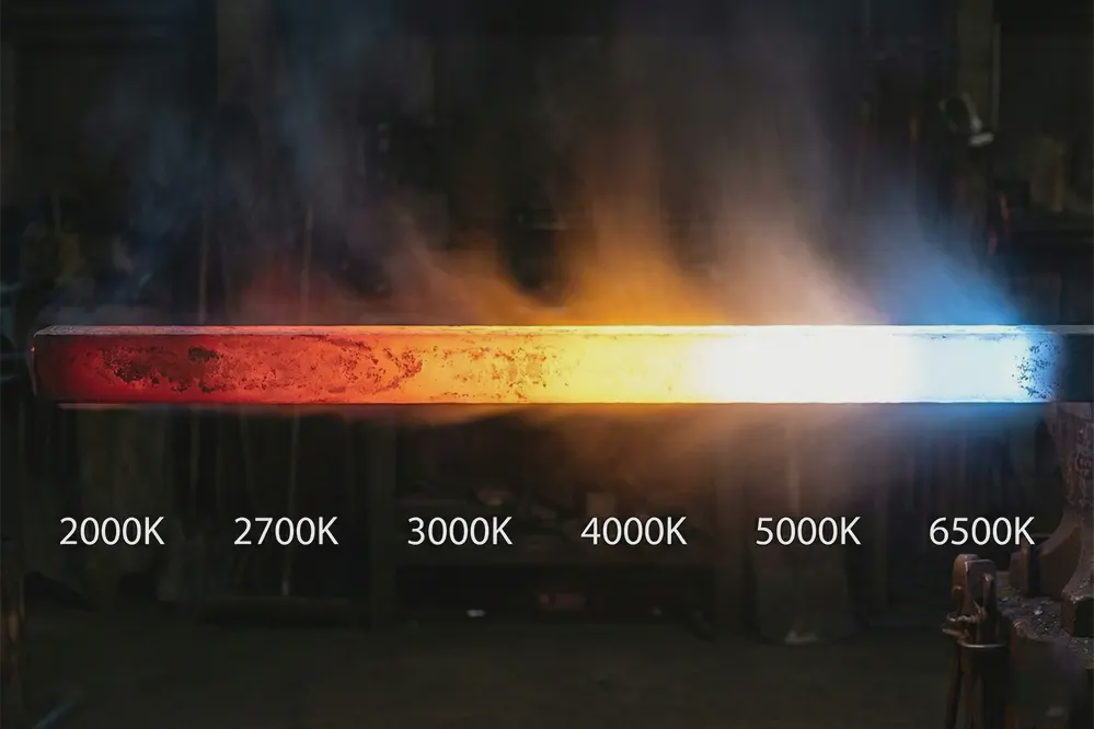
Color temperature measures the appearance of light on a warm-to-cool scale, expressed in Kelvin (K), ranging from yellowish-orange at low temperatures to bluish-white at high temperatures.
More technically, color temperature refers to the Correlated Color Temperature (CCT)—the color of light emitted by a theoretical black body radiator heated to a specific temperature. The measurement runs from 1000K to 10000K, though most LED lighting applications fall between 2000K and 6500K.
When you heat metal, it glows. At lower temperatures, that glow appears red or orange. As the temperature increases, the color shifts through yellow, white, and eventually blue-white. CCT uses this same principle to describe light color numerically.
For LED lighting, CCT tells you whether a fixture produces warm (yellowish), neutral (balanced white), or cool (bluish-white) light. This single number shapes how a space feels, affects occupant mood, and even influences biological rhythms.
Understanding the Kelvin Scale
The Kelvin scale measures absolute temperature starting at absolute zero (-273.15°C). Lord Kelvin developed this scale in the 1800s while studying black body radiation and electromagnetic waves.
Here's the part that confuses people: lower Kelvin numbers produce warmer-looking light, while higher Kelvin numbers create cooler-looking light. A 2700K bulb glows with yellowish warmth. A 6500K bulb emits crisp, bluish-white light.
This seems backwards until you understand the physics. When you heat a black metal object to 2700 Kelvin, it glows with that warm, orange-red color. Heat it to 6500 Kelvin and it radiates bright, blue-white light. The terminology reflects the actual temperature at which a physical object would glow that color, not whether the light feels "warm" or "cool" to our perception.
Think of it this way: The color comes first, the feeling second. A candle flame sits around 1900K—low temperature, warm orange glow. Noon sunlight measures roughly 5500K—high temperature, bright white light.
The Science Behind Color Temperature
Lord Kelvin established color temperature measurement in the 1800s through his work on black body radiation. When objects heat up, they emit electromagnetic radiation at wavelengths that correspond to specific colors. This created a reliable system for describing light color numerically.
LEDs produce light differently than incandescent bulbs—through electroluminescence rather than heated filaments. Manufacturers use different semiconductor combinations to generate specific wavelengths, each matched to a particular Kelvin temperature. This allows precise engineering of 2700K warm white, 6500K daylight white, or anything between.
Color Temperature Ranges Explained
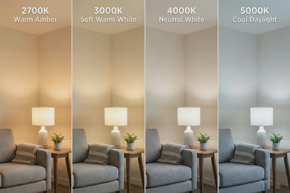
Warm White (2000K-3000K)
Warm white produces yellowish, orange-toned light that creates a cozy, inviting atmosphere. At 2000K, you'll see deep amber tones similar to candlelight. At 3000K, the light appears as soft white with yellow undertones.
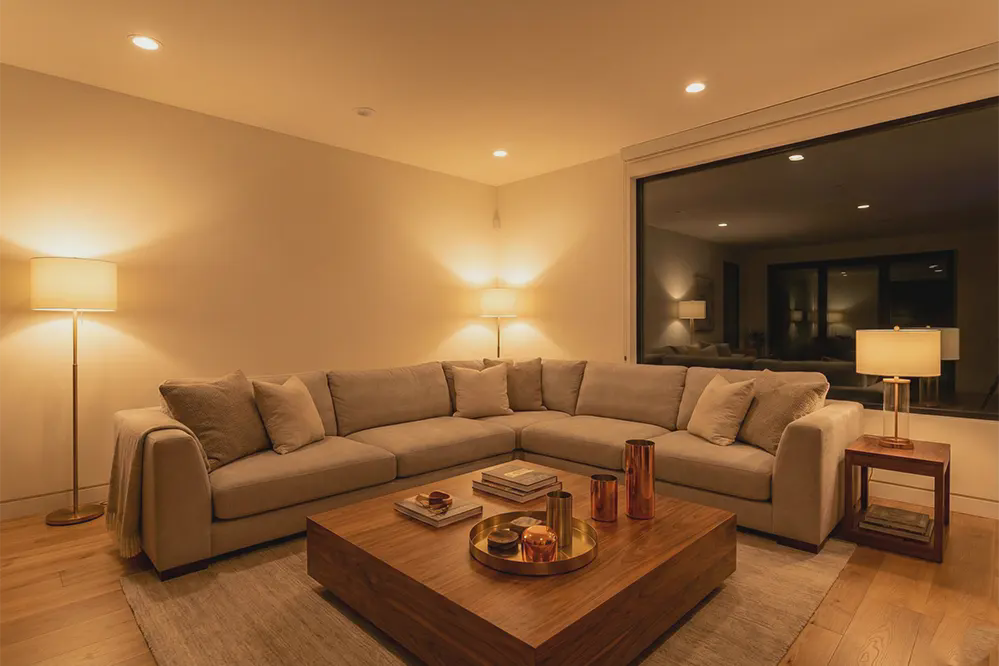
This range excels in residential living spaces, bedrooms, restaurants, hotel lobbies, and anywhere comfort matters more than task visibility. The warm tones encourage relaxation and social interaction. Your brain associates these colors with evening, sunset, and fire—natural signals that it's time to wind down.
Most people find 2700K closely matches traditional incandescent bulbs, making it the go-to choice for replacing old fixtures without changing the room's feel.
Neutral/Natural White (3500K-4500K)
Neutral white strikes a balance between warm and cool, producing clean white light without strong yellow or blue tints. At 4000K, often called "natural white," the light appears crisp and functional while maintaining some warmth.
This range works for offices, kitchens, retail spaces, and multipurpose areas where you need good visibility without the clinical feel of higher color temperatures. The versatility makes 4000K popular in commercial settings—bright enough for productivity, warm enough to avoid harshness.
Schools, hospitals (non-clinical areas), and modern office buildings often specify 4000K as a compromise that satisfies both task requirements and occupant comfort.
Cool White/Daylight (5000K-6500K)

Cool white to daylight produces bright white to bluish-white light that mimics midday sun. At 5000K, you get clean, energizing light. At 6500K, the blue tint becomes noticeable and the light feels distinctly "cool."
This range fits warehouses, industrial facilities, hospitals, outdoor security lighting, and retail environments where product visibility matters. The crisp quality enhances alertness and makes detail work easier. Colors appear more vibrant and true under these temperatures, assuming good CRI.
However, some people find 6500K too harsh for extended exposure, and research suggests very high color temperatures may disrupt sleep patterns if used in evening environments.
Common Color Temperature Comparisons
2700K vs 3000K
2700K produces softer, more amber light that closely resembles incandescent bulbs. It creates intimate, relaxing spaces perfect for bedrooms and living rooms where comfort is priority.
3000K shifts slightly toward neutral, giving you warm white with less yellow saturation. It maintains the cozy feel while providing better clarity for reading, cooking, or detailed tasks.
The 300-degree difference matters more than you'd expect. In a bedroom, 2700K helps with sleep preparation. In a kitchen, 3000K provides enough warmth for comfort while giving you better visibility for food preparation.
Choose 2700K when ambiance trumps function. Choose 3000K when you need warmth plus practical visibility.
3000K vs 4000K
3000K keeps you firmly in warm white territory with noticeable yellow undertones. 4000K crosses into neutral white, losing most of that yellow cast for cleaner, whiter light.
This comparison often comes up in commercial projects. A boutique hotel might use 3000K to maintain upscale warmth throughout. A modern office building would likely specify 4000K for alertness and productivity.
In residential kitchens, 3000K works well for evening family dinners while 4000K excels for morning meal prep and detailed cooking. Some homeowners split the difference, using 3000K in dining areas and 4000K over countertops.
4000K vs 5000K
4000K sits at the neutral point—white light that doesn't lean warm or cool. 5000K shifts into daylight territory with noticeably cooler, brighter appearance.
Retail stores face this choice regularly. Clothing retailers often prefer 4000K because it flatters both warm and cool tones without distortion. Electronics retailers might choose 5000K to showcase products with crisp, energetic lighting that suggests technological sophistication.
For home workshops and garages, 5000K provides maximum visibility for detailed work. But in adjacent spaces like mudrooms or laundry rooms, 4000K might suit better by maintaining functionality without excessive coldness.
5000K vs 6500K
Both fall into the cool white/daylight category, but 6500K takes the blue tint further. At 5000K, you get bright daylight without strong color cast. At 6500K, the bluish tone becomes prominent.
Few residential applications call for 6500K. It's common in photography studios, graphic design workspaces, and industrial facilities where color accuracy under daylight conditions matters. Some people find 6500K uncomfortably harsh for general use.
The American Medical Association has noted concerns about lighting above 5700K potentially disrupting circadian rhythms and affecting sleep quality. For most applications, 5000K delivers the benefits of cool white lighting without pushing into problematic territory.
Color Temperature vs Brightness: Clearing Up the Confusion
Here's a critical distinction that trips up buyers constantly: Kelvin measures color, not brightness.
A 2700K bulb and a 5000K bulb with identical lumen output produce exactly the same amount of light. One appears warm and yellowish, the other cool and white, but they're equally bright. Lumens measure brightness. Kelvin measures color.
The confusion comes from our perception. Cool white light (5000K) often looks "brighter" than warm white (2700K) even when both produce the same lumens. Your eyes are more sensitive to the blue wavelengths in cool light, creating an illusion of increased brightness.
This matters when you're selecting LEDs. Don't assume higher Kelvin gives you more light. Check lumens for brightness, then choose color temperature based on atmosphere and application. A 1000-lumen, 2700K bulb produces the same light output as a 1000-lumen, 5000K bulb—just with different color.
Manufacturers sometimes exploit this confusion by offering high-Kelvin products in commercial settings because the "brightness perception" lets them deliver fewer lumens while maintaining that crisp, well-lit feeling. Smart buyers specify both lumens and color temperature independently.
The Biological Impact of Color Temperature
Your body's circadian rhythm responds directly to light color. For thousands of years, humans experienced warm, dim light in evening (fire) and bright, cool light during day (sun). Your hormones and alertness evolved around this cycle.
Blue-rich light (4000K+) triggers serotonin production—the neurotransmitter for wakefulness and focus. This is why sunny days feel energizing. In offices and schools, cooler temperatures support concentration. The same light in evening makes relaxation harder.
Warm light (2700K-3000K) triggers melatonin—the hormone regulating sleep. As sunlight shifts from 5500K at noon to 2500K at sunset, your body interprets warming light as preparation for rest. Bedrooms and evening-use spaces benefit from warm temperatures.
The American Medical Association noted in 2016 that LED lighting above 5700K contains high blue-spectrum light that may affect sleep patterns. They recommend limiting high-CCT lighting in evening hours. This doesn't make 5000K+ harmful—it's appropriate for many commercial and industrial settings—but suggests thoughtful placement and timing.
Color Temperature and Color Rendering Index (CRI)
Understanding the Difference
Color temperature and Color Rendering Index measure completely different aspects of light. CCT describes the color of the light source itself—warm or cool. CRI measures how accurately that light source renders the colors of objects.
Think of it this way: CCT is the color of the flashlight beam. CRI is how well that flashlight shows you the true colors of whatever you're illuminating.
You could have 3000K warm white with terrible CRI (50) that makes everything look muddy and dull. Or you could have 3000K warm white with excellent CRI (95) that reveals rich, accurate colors. The warmth is the same. The color accuracy is dramatically different.
Why Both Metrics Matter
High color temperature with low CRI creates harsh, unflattering light. A 5000K warehouse fixture with CRI 70 will feel cold and industrial, washing out colors and making the environment less pleasant.
High CRI with inappropriate color temperature doesn't solve the problem either. A 6500K bulb with CRI 95 in a bedroom might render colors beautifully, but the cool blue tone will still disrupt your sleep.
The best lighting achieves both: appropriate color temperature for the application, plus high CRI (80 minimum, 90+ preferred for color-critical work) for accurate color rendering.
Practical Application
Choose color temperature first based on room function and desired atmosphere. Then specify high CRI within that temperature range. For LED strip lighting under cabinets, you might choose 3000K for warmth in the kitchen, then specify CRI 90+ to ensure food colors look appetizing and accurate.
In retail, the jewelry counter needs both correct color temperature (often 4000K) and high CRI (95+) to show gemstones and metals accurately. In a warehouse, you prioritize visibility with 5000K and can accept CRI 80 because precise color rendering matters less.
Color Temperature by Room and Application
Residential Applications
Living Rooms: 2700K-3000K creates inviting atmosphere for relaxation and conversation. Use 2700K for traditional settings or 3000K for modern spaces. Keep all fixtures at the same temperature for consistency.
Bedrooms: 2700K-3000K supports healthy sleep patterns. Cool temperatures suppress melatonin and make evening wind-down harder. Even for morning tasks, 3000K provides adequate visibility with sufficient lumens.
Kitchens: 2700K-4000K balances function and ambiance. 3000K works as a compromise—warm enough for evening comfort, bright enough for cooking tasks. Consider 3000K ambient with optional 4000K under-cabinet strips.
Bathrooms: 3000K-4000K for grooming tasks while maintaining comfort. 3000K suits powder rooms and master baths. 4000K works for family bathrooms with heavy morning use. Vanity lighting benefits from 3000K-3500K with high CRI (90+).
Home Offices: 3500K-5000K promotes alertness and reduces eye strain. 4000K hits the sweet spot for most people. If you work evenings, stay at 4000K or lower to avoid disrupting sleep cycles.
Garages and Workshops: 4000K-5000K provides crisp, shadow-reducing light for detailed tasks and safety. 5000K offers maximum visibility. The cool tone prioritizes function over comfort in these utility spaces.
Commercial Applications
Office Spaces: 3000K-4000K balances productivity with comfort. 4000K has become standard—bright enough for alertness, neutral enough to avoid harshness. Interior spaces without windows benefit from 4000K to compensate for lack of natural light.
Retail Environments: 2700K-4000K varies by brand and merchandise. Upscale boutiques use 2700K-3000K for luxury feel. Electronics retailers prefer 4000K-5000K for technical appeal. Grocery stores use 4000K-5000K for vibrant produce display. Clothing stores stay 3000K-4000K to flatter fabrics and skin tones.
Warehouses and Industrial: 5000K prioritizes visibility, safety, and efficiency. Cool tone provides maximum perceived brightness for navigating and completing tasks. CRI 80 suffices unless specific manufacturing requires higher accuracy.
Healthcare Facilities: 3500K-5000K varies by space. Patient rooms use 3500K-4000K for comfort. Clinical areas require 4000K-5000K for accuracy and alertness. Waiting rooms use 3000K-3500K to reduce anxiety.
Hospitality: 1800K-3000K prioritizes guest comfort. High-end restaurants use 2200K-2700K for intimate atmosphere. Hotel lobbies use 2700K-3000K for welcoming warmth. Guest rooms specify 2700K-3000K with optional 3500K bathroom vanity lighting.
Educational Facilities: 3500K-5000K keeps students alert. 4000K works for most classrooms. Cafeterias use 3000K-3500K for relaxed atmosphere. Libraries benefit from 4000K for extended study sessions.
Color Temperature in LED Strip Lighting
LED strips come in standard temperatures: 2700K, 3000K, 4000K, 5000K, and 6500K. Single-color strips produce fixed temperature. Tunable white strips contain warm and cool LEDs for dynamic adjustment.
Quality varies significantly. Budget strips show poor consistency—the first foot might be 3000K while the end appears 3500K. This becomes obvious in under-cabinet or cove lighting. Use reputable manufacturers with proper LED binning.
Under-Cabinet Lighting: Kitchen tasks perform best at 3000K-4000K. Mount strips toward cabinet back, angled downward to prevent seeing individual dots. Use aluminum channels with frosted diffusers for smooth distribution.
Architectural Accents: Cove and crown molding typically use 2700K-3000K for subtle drama. Match accent strip temperature to room ambient lighting for cohesive results.
Tunable White: These strips blend warm (2700K) and cool (5000K or 6500K) LEDs for any temperature between. Circadian lighting systems use this to mimic natural daylight cycles. Costs more but provides maximum flexibility.
For runs longer than 16 feet, inject power at both ends to prevent voltage drop affecting brightness and color temperature. Premium strips use 2-step MacAdam ellipse binning for consistent color across the entire run.
How to Choose the Right Color Temperature
Step 1: Identify Function - Task environments need cooler temperatures (4000K-5000K). Relaxation spaces need warm (2700K-3000K). Consider time-of-day use. Multi-purpose spaces work with middle-ground (3500K-4000K), layered temperatures, or tunable white.
Step 2: Consider Décor - Warm materials (wood, copper, warm paint) look best with 2700K-3000K. Cool materials (concrete, steel, gray) handle 4000K-5000K. Neutral palettes work with any temperature—choose by function.
Step 3: Evaluate Natural Light - Abundant daylight allows slightly warmer artificial lighting. Limited natural light benefits from slightly cooler temperatures. Consider time of use versus light availability.
Step 4: Time-of-Day Use - Morning/midday spaces tolerate cooler temperatures. Evening-use spaces require warm temperatures for healthy sleep patterns. All-day spaces need neutral (3500K-4000K) or tunable white.
Step 5: Test First - Get samples. Install in actual space. View at different times. See how they interact with materials and adjacent spaces. Test dimming behavior too.
Decision Framework: Function beats aesthetics. Start with recommendations, adjust for preference. Maintain consistency across related spaces. Temperature variation should mark intentionally separate zones.
Advanced Considerations
Mixing Temperatures: Strategic mixing works for layered lighting—2700K ambient plus 3000K task creates visual hierarchy. Keep differences under 500K. Never mix within same fixture type or visual plane. Mismatched recessed cans look like mistakes, not design.
Dimming Effects: Standard LEDs maintain color temperature when dimmed. Warm dimming technology intentionally shifts warmer as you dim—3000K to 2000K—mimicking incandescent behavior. Specify explicitly if this matters.
Color Consistency: LED binning tolerances create variation. Premium manufacturers use 2-step MacAdam ellipses for consistent color. Budget products use 5-7 step binning, showing noticeable variation in linear installations.
Manufacturer Variations: Different manufacturers' "3000K" can look noticeably different. Stick with same manufacturer for consistent results. Premium brands maintain tighter quality control across production runs.
FAQ
Is 3000K or 4000K better for home use?
3000K works better for most residential spaces including living rooms, bedrooms, and dining areas. It provides warm, inviting light that supports evening relaxation and healthy sleep patterns. Use 4000K in task-oriented spaces like home offices, laundry rooms, and garages where function matters more than ambiance. Kitchens can use either—3000K for traditional, cozy feel or 4000K for modern, functional approach.
What Kelvin is best for reducing eye strain?
4000K-5000K reduces eye strain for computer work and detailed tasks. These color temperatures provide crisp visibility without the harshness of higher Kelvin ratings. However, proper lighting levels (lumens), positioning to avoid glare, and screen brightness settings affect eye strain more than color temperature alone. If you work into evening hours, consider 4000K instead of 5000K to minimize sleep disruption.
Can you mix different color temperatures in one room?
Yes, but only with intentional layering. Use one temperature for ambient lighting and a different (but close) temperature for task lighting—like 2700K recessed fixtures plus 3000K desk lamps. Keep the difference under 500K for subtle contrast. Never mix temperatures in the same fixture type or the same plane—all recessed ceiling fixtures should match. Dramatic temperature mixing between connected spaces feels disjointed and poorly planned.
What color temperature is natural sunlight?
Natural sunlight varies throughout the day. Sunrise and sunset measure 2000K-3000K, producing warm orange and yellow tones. Midday sun ranges from 5000K-5500K with bright white light. Overcast daylight can reach 6500K-7000K with cool, blue-tinted appearance. This natural variation is why your circadian rhythm responds to color temperature—your body uses light color to determine time of day.
Does higher Kelvin use more electricity?
No. Color temperature has no impact on energy consumption. A 10-watt LED produces the same energy use whether it's 2700K or 6500K. Wattage determines electricity use. Lumens determine brightness. Kelvin only determines color appearance. The misconception comes from cool white light appearing "brighter" to our eyes than warm white at the same lumen output, making people assume it uses more energy when it doesn't.
What's the most popular color temperature for homes?
2700K-3000K dominates residential applications. 2700K closely matches traditional incandescent bulbs, making it the default choice when replacing old fixtures. 3000K has gained popularity in modern homes because it provides warmth while offering slightly better clarity for tasks. Regional preferences vary—European homes often prefer 2700K while some modern American homes trend toward 3000K. Ultimately, choose based on your space requirements rather than popularity.
Why does warm light have a lower Kelvin number?
The Kelvin scale measures the temperature at which a black body radiator would glow that color. Heated metal glows red-orange at lower temperatures (2700K) and blue-white at higher temperatures (6500K). The scale follows physics, not perception. When we say "warm" lighting, we're describing the emotional feeling and color appearance (yellow, orange, cozy), not the actual temperature number. It seems backwards until you remember we're measuring the heat required to make metal glow that color.
What is the best color temperature for LED strips?
For under-cabinet kitchen task lighting, use 3000K-4000K. 3000K provides warm light that complements most kitchen designs while offering good task visibility. 4000K works when you prioritize function and want crisper light for detailed food preparation. For accent lighting and architectural details, use 2700K-3000K to create subtle ambiance. Match strip temperature to room ambient lighting for cohesive results. Consider tunable white strips for maximum flexibility if budget allows.
Conclusion
Color temperature shapes how every space feels and functions. The right Kelvin rating creates comfortable, productive environments. The wrong choice leaves rooms feeling harsh, cold, dim, or simply off.
Remember these key principles: Match temperature to room function first—task spaces need cooler light (4000K-5000K), relaxation spaces need warmer light (2700K-3000K). Consider biological effects—cool light promotes alertness, warm light supports healthy sleep. Test before committing to large orders—color temperature looks different in real spaces than on spec sheets.
Start by identifying your space's primary purpose. Use the room-by-room recommendations as a starting point, then adjust for personal preference, existing décor, and natural light conditions. When in doubt, choose warmer—it's easier to add cooler task lighting than to correct overly cold ambient lighting.
Your next step is simple: list your spaces, identify their primary functions, and note the recommended Kelvin ranges. Sample bulbs in those ranges. Install them temporarily and live with them for a few days. Your eyes and body will tell you what works. Trust that feedback and specify accordingly.